Beyond Blue and Grey: Common Color Contrast Mistakes in Suit Pairing
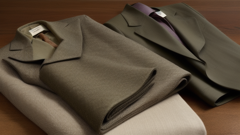
Ask most men why a suit-shirt-tie combination “looks off” and you’ll rarely get a precise answer — just a vague sense that something isn’t working. In almost every case, the real issue is contrast, not color choice itself. Navy and burgundy are not inherently clashing colors; the problem is usually how saturated, how light, or how warm each piece is relative to the others and relative to the wearer’s own coloring. Here are the contrast mistakes that come up again and again, along with the principle that fixes each one.
Mistake 1: Matching Saturation Instead of Contrasting It
A common instinct is to pick a tie that matches the “intensity” of the suit — a deep, richly saturated navy suit paired with an equally deep, richly saturated tie. The result often looks flat and heavy, because nothing in the outfit provides a visual break. The fix is to let one element carry high saturation while the others stay muted. A deeply saturated burgundy tie works well against a muted, mid-tone grey suit; the same tie against an equally saturated navy suit can look congested rather than rich.
Mistake 2: Ignoring Undertones When Choosing “Neutral” Colors
Grey, navy, and white are often treated as universally safe, but each has warm and cool variations, and mixing undertones carelessly creates a subtle clash even when the colors seem compatible on paper. A cool, blue-grey suit paired with a cream shirt that leans warm and yellow can create a muddy contrast at the collar, even though “grey and cream” sounds like a safe combination. Matching undertone temperature — keeping warm with warm, cool with cool — across suit and shirt removes this almost invisible but persistent clash.
Mistake 3: Choosing Tie Color Based on the Suit Alone
The suit-tie relationship gets most of the attention, but skin tone is actually the anchor point that determines whether a color combination reads as flattering or washed out. Men with warmer, more golden undertones generally find that earthy tones (rust, olive, warm burgundy) sit more naturally near the face than cool-toned jewel colors, which can look slightly harsh by comparison. Men with cooler, pinker undertones often find the reverse — jewel tones like sapphire or deep plum read as vibrant, while warm rust tones can look slightly dull against their skin. The suit is a backdrop; the tie sits closest to the face and interacts directly with skin tone in a way the jacket never does.
Mistake 4: Letting the Shirt Disappear Into the Suit
When a shirt’s color sits too close to the suit’s shade — a light blue shirt under a mid-blue suit, for example — the eye has nothing to anchor on, and the tie ends up looking like it’s floating in isolation rather than part of a coordinated outfit. A starker contrast between suit and shirt (crisp white or a clearly lighter blue against a mid or dark navy suit) gives the tie a proper stage and makes the whole combination read as intentional rather than accidental.
Mistake 5: Overlooking the Pattern-on-Pattern Contrast Problem
Color contrast mistakes compound quickly when patterns enter the mix. A finely striped shirt under a subtly patterned suit can create a visual vibration at a distance, even if the colors themselves are coordinated correctly. When combining any two patterns, vary the scale significantly — a fine pinstripe suit pairs more comfortably with a solid or a large-scale tie pattern than with another fine stripe, regardless of how well the colors match.
A Simple Three-Point Contrast Rule
Before leaving the house, run through this quick mental checklist:
- Value contrast: is there a clear difference in lightness/darkness between at least two of the three pieces (suit, shirt, tie)?
- Saturation contrast: is only one piece carrying the most intense color, with the others muted by comparison?
- Undertone consistency: are the warm/cool temperatures of each piece compatible with each other and with your own skin tone?
If an outfit satisfies all three, it will almost always photograph and read well in person, even with color combinations that might look risky on paper.
Testing Contrast Before You Commit
A simple trick before buying a new tie: hold it up under the same light you’ll actually wear it in (daylight and indoor incandescent light shift color perception meaningfully), next to the shirt and jacket you intend to pair it with. Squint slightly — this blurs fine detail and makes value contrast easier to judge at a glance. If the tie seems to vanish into the suit or the shirt when you squint, the value contrast is too low and the combination will likely look flat in photographs, even if it seemed fine under direct inspection.
Mistake 6: Forgetting That Lighting Changes Everything
A combination assembled under warm bedroom lighting can look noticeably different under the cool fluorescent lighting of an office or the harsh flash of an event photographer. Warm incandescent light tends to flatter reds, browns and warm neutrals while slightly dulling blues and greens; cool daylight or fluorescent light does the opposite. If an outfit is being chosen for a specific event — a wedding reception, an office presentation, an evening dinner — it’s worth considering what the dominant lighting will be, since a combination that reads as perfectly balanced at home can shift subtly once under different light.
Why This Matters More Than “Matching” Colors
Classic color theory advice like “navy and burgundy always work” is true only as a starting point — the actual success of the combination depends on how each piece’s saturation, value, and undertone interacts with the others and with the wearer. Once you train your eye to check contrast rather than simply checking whether colors are traditionally paired, you’ll find a far wider range of combinations open up, many of which never would have seemed “safe” by conventional rules alone.
Think of it less as a fixed list of approved pairings and more as a set of relationships to check every time: value against value, saturation against saturation, warmth against warmth. Colors that break the traditional “rules” can still work beautifully as long as those three relationships are balanced — and colors that follow every traditional rule can still fall flat if the contrast between pieces is wrong. Training your eye to see contrast, rather than memorizing combinations, is what actually makes a wardrobe versatile over time.